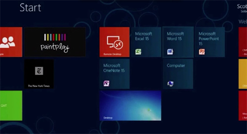
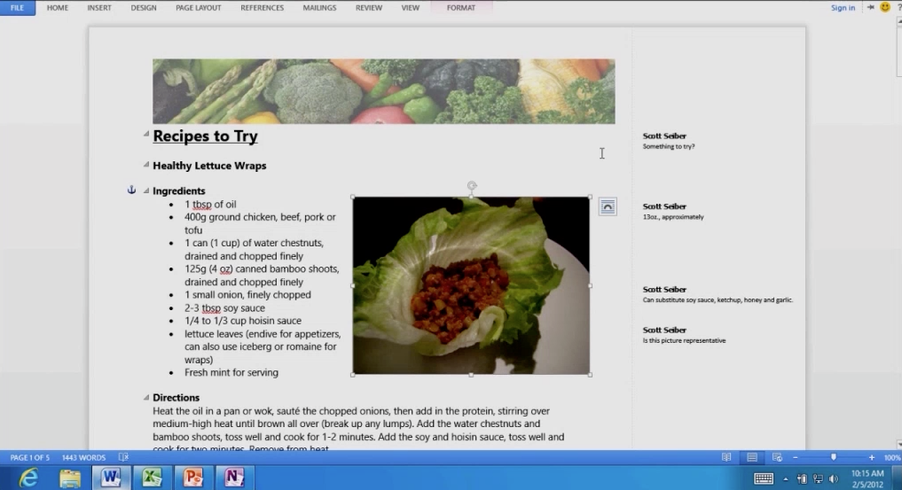
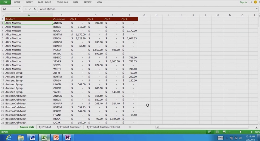
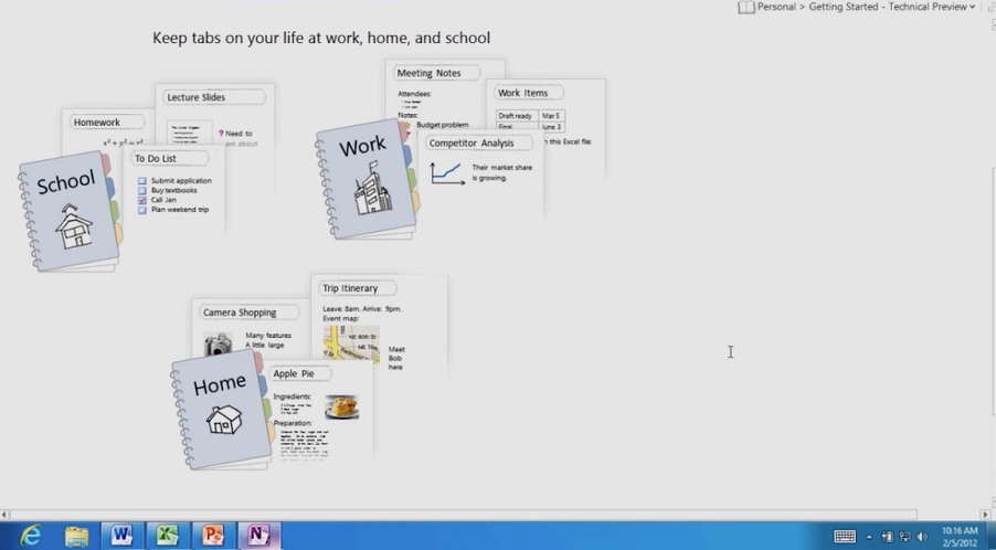
Screenshots that showcase the all new office 15 UI, or the UI of the next version of Office
Microsoft has finally shown off the first glimpse of the next version of Office, aka Office 15 and we can’t resist ourselves from saying that the next generation Office UI is drastically different and simplified than the one which loyal Office users have been used to.
As you can yourself notice in the screenshots for the next genenation Office UI, Office 15 (or Office 2012) is going to be much flatter, simpler and without much lines or shortcuts at the front end. The UI is obviously inspired from the Windows 8 UI.
The most surprising change in Office 15’s UI is the absence of Ribbon interface, something that was introduced with Office 2007 and spread further in other applications with the release of Office 2010. Looks like Microsoft wants to hide everything under the shelves, in pursuit of keeping the UI free from distractions.
Microsoft Office 2012 screenshots are also indicating that users will experience uniform design code while using Windows 8 along with Office 15 (or Microsoft Office 2012).
The upcoming office UI looks more polished and appropriate for the touch interface, which is quite thoughtful as next Office version is going to debut in an era which will coincide with the launch of much awaited and touch-optimized Windows 8.
It makes a lot of sense for Microsoft to create an Office version that works equally well in touch based devices(such as tablets) as it works in non-touch devices(such as PC, notebooks) and this vindicates the decision of Office team to go with flatter, clutter-free design theme for Office 15.
Here’s a video from The Verge that takes you through a preview version of ‘Office 15’, running on Windows 8 on an ARM device. Take a look!


